
Zara Website Redesign
The redesign of Zara’s retail website aimed to resolve usability challenges identified in testing and improve the overall shopping experience. Key issues were addressed in navigation, search visibility, and checkout flow, where users struggled with confusing menus, a poorly defined search bar, and hidden checkout elements. The proposed solutions resulted in a 60% increase in successful completions, on average tasks were completed 45 seconds faster, a 31% improvement in efficiency, and user errors during tasks were reduced by nearly 40%.
Methodology
1. Research
2. Usability Testing
3. Prototype
4. Key Findings
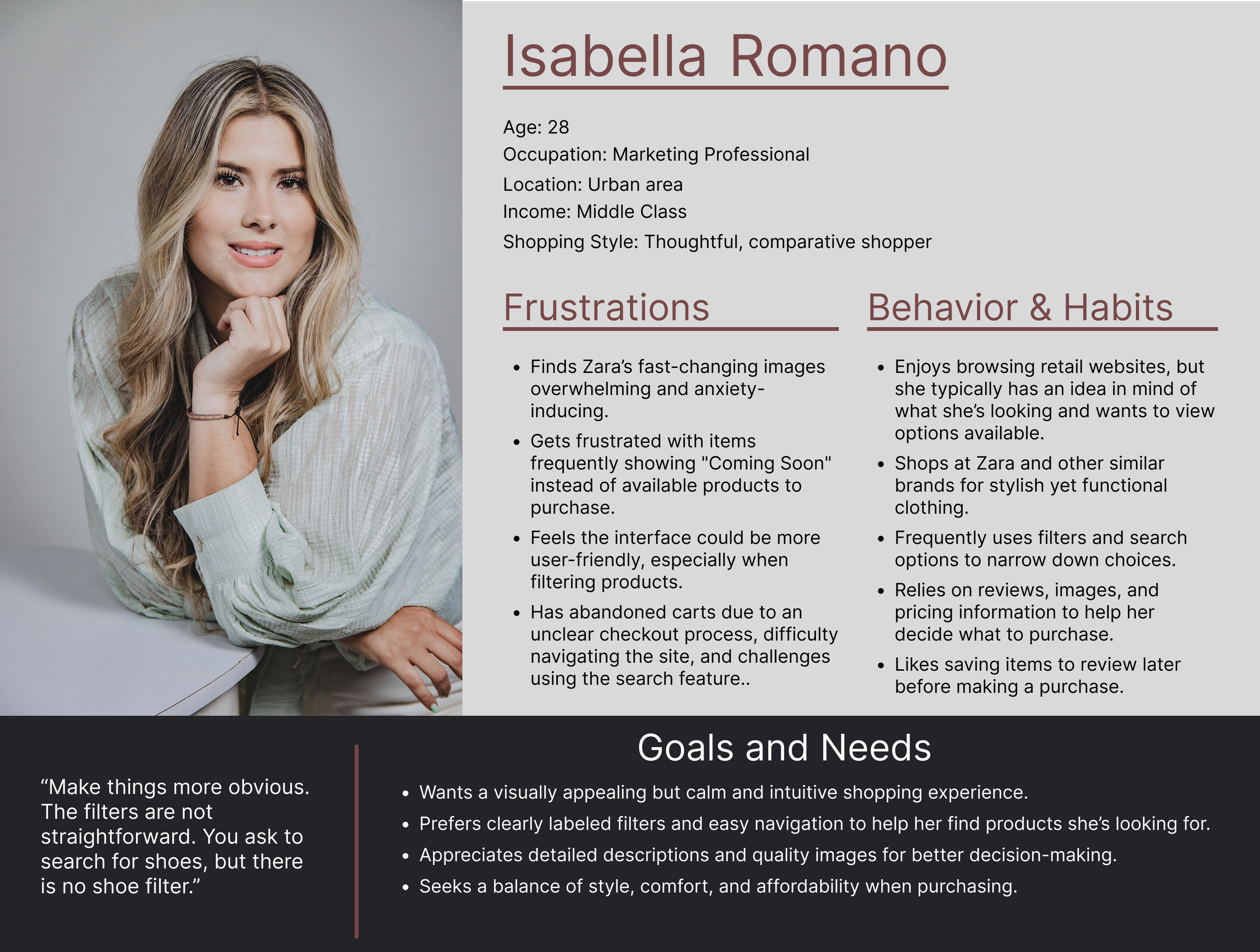
A heuristic evaluation and website analysis of Zara.com were conducted, identifying key usability issues based on Nielsen’s 10 Usability Heuristics. This process revealed challenges related to navigation, the layout & design, and accessibility, as well as insights into typical user behaviors. Personas were then developed to represent the range of customers engaging with or intending to engage with the products.
1. Research
-
Key elements like the search button was separated from the product category links.
Side pop-up menu is too small, required excessive scrolling, and had a translucent background that reduces readability.
The absence of a standard "Home" button may be confusing for users.
-
Overall flow of the website is disorienting, inconsistent page structures, and varying product card designs across categories.
Some pages lack clear titles, making navigation and context difficult for users.
-
Font styles are too slim and small, making content hard to read.
Text is sometimes layered over images, reducing readability.
Rapid image transitions and unexpected language settings can disorient users, especially those with visual or cognitive sensitivities.
Personas

2. Usability Testing
Remote and in-person usability tests were conducted with 8 participants, recording interactions and measuring task performance across product search, checkout, and navigation. The combination of usability testing, think-aloud protocol, and surveys provided both qualitative and quantitative insights into user behavior and challenges. These methods expanded participant reach, enabled accurate recording of user processes, and maintained cost efficiency, making it an effective approach for generating actionable usability recommendations within budget constraints.
-
Moderated Usability Testing:
Participants completed tasks while we observed and noted difficulties.
Think-Aloud Protocol:
Users verbalized their thoughts while navigating Zara.com.
Surveys & Post-Test Interviews:
Feedback was collected using a survey form & a short follow-up interview was conducted to clarify usability pain points.
-
Each participant completed three tasks on the Zara.com retail website which covered the process of browsing the website, using the search feature, and completing the checkout process.
Task Scenario 1: Use zara.com to browse for a coat that you would like to purchase under $100.
Task Scenario 2: Use the search button to look up a clothing item of your choice and add it to your cart.
Task Scenario 3: Complete the checkout process to purchase the items in your cart.
-
Recruitment:
Family, Friends, University groups, online forums (Reddit,
Discord), and social media (Instagram, Tiktok).
Screening Survey:
Candidates for testing completed a screener which ensured that they were in the demographic of users we wanted to test.
-
Screen Recording:
Used Zoom to record participants screens as they completed tasks for later review
Survey Collection:
Users filled out a Google Form before, during, and after participating in the usability testing.
Data Organization & Reporting:
Created an Affinity Diagram using Figma to organize findings and recognize patterns emerging from research.
Usability Testing Metrics

Success Rate, Errors, & Time to Complete Tasks
Documenting success rates, number of errors, and time it took participants to complete tasks was used to gain a better understanding of how intuitive tasks were.

Post Test Survey
The sessions were concluded with a post-test survey of multiple choice questions to better understand the overall experience of the participant and pinpoint areas for improvement.

Post Task Interviews
A follow up interview was conducted after each task to ensure that any additional input from the user was recorded and to discuss any issues they experienced while completing the task.
3. Prototype
Header & Navbar
The current header and navbar do not follow design conventions that are standard for similar retail websites. Users who were tested found these practices to be confusing and more difficult to navigate than other sites they had used before.
Zara’s Current Header

Redesigned Header
The current design for the header has a transparent background causing the text to blend in with images on the page, making it difficult to read and to locate essential features such as the search bar, shopping cart, login, and help.

Changing the background color to be white instead of transparent makes the text much easier to read when scrolling through the page.

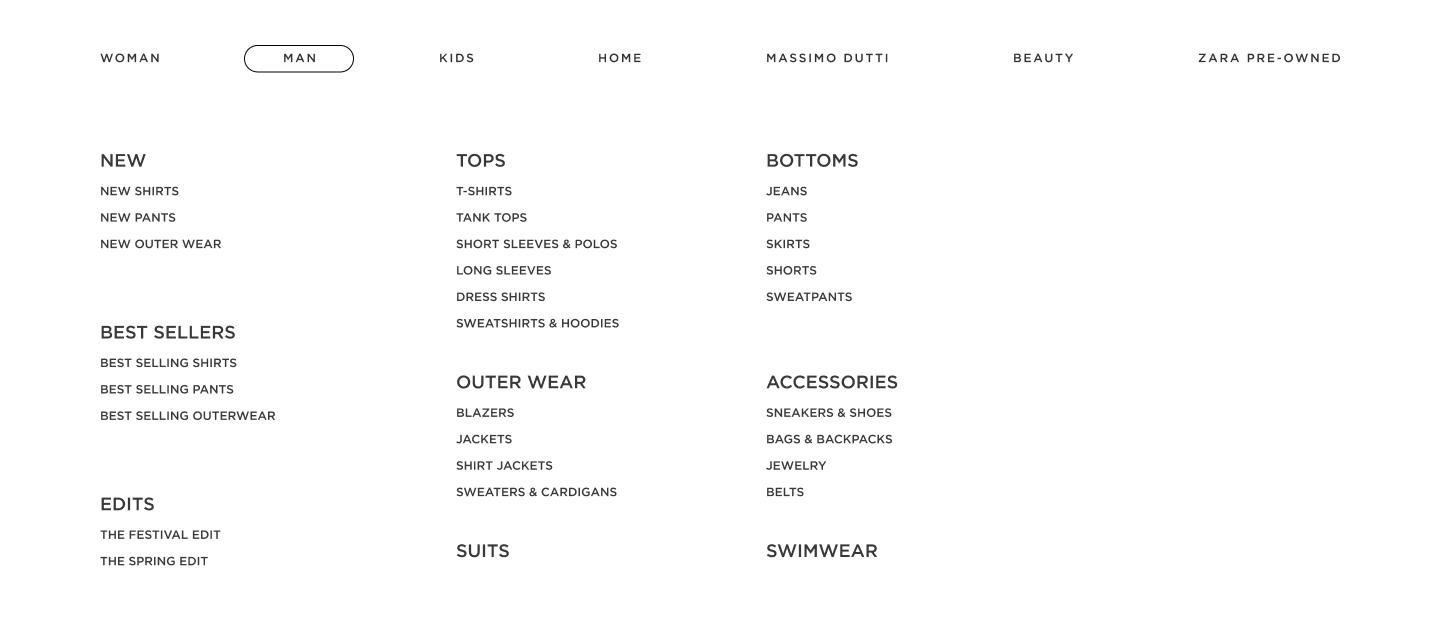
The main navigation is currently hidden on desktop screen sizes in a hamburger menu that requires users to scroll horizontally to view all the categories. Additonally, the products featured on the current website are displayed in one long list. User testing revealed that this is frustrating to users as it is difficult to find the category they are looking for.

Zara’s Current Main Navigation
The main navigation was redesigned to be a dropdown menu when users select a tab in the navbar. Products in the menu are now organized into categories of clothing items and subcategories of products.
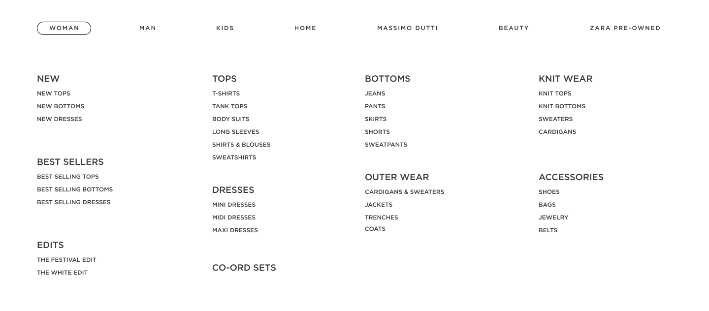
Redesigned Main Navigation
Product Pages
Product pages were redesigned to improve layout clarity, enhance filtering options, enable easier view switching, and include prominent page titles for better orientation, addressing the previous lack of titles.

Current Product Pages on Zara’s Site

Product cards were resized for full on-screen visibility, with consistent margins and uniform image sizes. User testing indicated that the previous large, inconsistent cards made it difficult to view product information and caused confusion about section boundaries.

Redesigned Product Page
Filtering options and “sort by” button were reorganized at the top of the page with dropdown menus, improving usability compared to the previous long, scrollable list. Additionally, the filter button on the current ZARA website has a transparent background and this menu disappears when a user scrolls up. That makes it more difficult to see and use this feature because it is often hidden on the page. The redesign includes a solid background which ensures the filters remain visible.

Current Filter & Sort Options

Current Filter (Side-Bar)
Redesigned Filter & Sort Options

The view buttons now clearly indicate layouts for two, three, or four products per row, replacing the previous numeric labels that confused users. This aligns with common e-commerce patterns and improves user understanding of the feature.

Current “View” Buttons

Redesigned “View” Button
Product Detail Pages
The product detail pages now allow users to select their size before clicking the “Add” to cart button, as well as view the size chart which was previously hidden. The product sizes available and size chart are now more prominently shown on the page. Participants found it confusing while completing tasks to click the “Add” to cart button before selecting a size and found it frustrating that they could not see what sizes were available when viewing the product detail page.

Current Product Detail Page

Redesigned Product Detail Page

Current Product Detail Page - Selecting a Size

Redesigned Product Detail Page - Selecting a Size
Usability testing and an evaluation of Zara.com informed key redesign recommendations to enhance navigation, search visibility, checkout efficiency, and overall accessibility. When tested, the proposed solutions resulted in a 60% increase in successful completions, on average tasks were completed 45 seconds faster, a 31% improvement in efficiency, and user errors during tasks were reduced by nearly 40%.
4. Key Findings
-
Consolidated all category links into a clearly labeled and organized dropdown menu.
Ensured the navigation remains visible across all pages, including when users scroll.
Use descriptive labels and accessible text that meet WCAG 2.1 contrast and sizing guidelines, improving usability for visually impaired users
-
Keep the search bar consistently visible across all pages, avoiding unnecessary page redirection.
Display real-time search suggestions and include a clearly marked text input field.
Avoid default product displays that distract from the user’s intent to search.
-
Reduce the number of checkout steps to a maximum of 2–3, removing redundant pages.
Make guest checkout easy to find and provide clear options to edit address and payment information.
-
Apply WCAG-compliant font sizes and contrast levels for optimal readability.
Avoid thin fonts and small text sizes, especially on product and checkout pages.
Disclaimer & Attribution
This case study was completed as a group project for a class assignment and represents a hypothetical redesign of the Zara retail website. It was not commissioned by or affiliated with Zara. The sections presented here highlight my individual contributions within the broader group effort.
My Role
Design - Prototyping Main Navigation, Product Pages, and Product Detail Pages
Research - Evaluation of the Website Based on Neilson’s 10 Heuristics, Developing Personas
User & Usability - Recruiting Participants, Writing Interview Scripts & Surveys, Conducting Interviews & Tests, & Analyzing Results
Team Members
Atley Egbert, Andrew Smith, Giovanni Volpi
Date Completed
Spring 2025