
Weatherly is a cross-platform weather app built to showcase Android and iOS prototypes. Through iterative design and usability testing, the app evolved into a more intuitive and engaging experience. User ratings for navigation rose by 26%, while task completion ratings improved by 12%. Efficiency and accuracy also increased: tasks were completed 48% faster with a 68% reduction in errors.
Weatherly App
Methodology
1. Research
2. Prototype
3. Usability Testing
4. Key Findings
As part of the Weatherly project, a competitor analysis was conducted by reviewing four major platforms: Weather Underground, AccuWeather, WeatherBug, and The Weather Channel. The analysis focused on identifying unique features, common design trends, information hierarchy, and gaps in usability across these apps and websites. This process revealed both opportunities to enhance the user experience and strategic directions to differentiate Weatherly’s design.
Research
-
Weather Underground differentiates itself with hyper-local forecasts from personal weather stations and engaging visuals, but seamed to suffer from cluttered organization and a lack of long-term climate insights—leaving room for clearer, more user-friendly design.
-
AccuWeather was found to offer in-depth forecasts, interactive maps, and health/activity insights, but was lacking immediate local weather on the homepage and clear explanations of weather terms.
-
WeatherBug provides extensive features like fire and air quality alerts, outdoor sports safety, commuter maps, and lightning tracking, but its crowded layout, inconsistent navigation, and distracting ads make it overwhelming— which highlighted an opportunity for clearer, more consistent, user-friendly design.
-
The Weather Channel did offer detailed forecasts, health tracking, and radar features, but its scattered layout, motion-heavy ads, and lack of favorites or clear activity guidance somewhat created an overwhelming experience.
Personas
To develop personas, a survey was distributed via email, text messages, and in-person invitations to friends, family, and classmates. The survey included a combination of demographic and behavioral questions which uncovered both functional and emotional requirements of users. This information was key for the development of three distinct personas representing Weatherly’s target audience. These personas highlighted user motivations, common usage habits, and frustrations with existing apps, creating a foundation for user-centered design decisions.
-
The survey included demographic questions such as age range, gender, and current city of residence, providing background context for understanding participant needs, expectations, and behaviors. Demographic information also revealed how different groups may approach a weather app differently and whether the sample captured a broad range of perspectives.
-
In addition to demographics, the survey gathered app-related insights to better understand usage patterns and priorities. Questions addressed frequency of smartphone use for checking the weather, primary mobile operating system (iOS or Android), the importance of accurate forecasts in daily activities, and the role of outdoor activities in shaping weather-related needs.
-
Study limitations included a small sample size of eight participants, a pool consisting primarily of friends, family, and acquaintances, and a limited geographic scope, with most participants residing in Northern Utah. Despite these constraints, the findings provided meaningful insights and direction for the design process.


2. Prototype
Three prototypes were created to guide the iterative design process for Weatherly: a low-fidelity paper prototype, a medium-fidelity Figma prototype, and a high-fidelity prototype for both android and iOS devices.
-
A low-fidelity paper prototype was used to test three core tasks: checking the weather for Salt Lake City on a specific day, saving Salt Lake City as a location, and finding the forecast for 6 p.m. on the same day. Usability testing for this prototype was conducted with three participants.
-
A medium-fidelity prototype was developed using Figma and was with four users on the same set of tasks to evaluate usability in a more structured interface.
-
A high-fidelity prototype was developed for both Android and iOS devices, both following guidelines and industry standards specific to each. This version expanded testing to five tasks, including finding weather for travel planning, checking current conditions for daily activities, exploring event-specific forecasts, viewing sunrise times, and saving new locations for ongoing reference. This progression from paper to digital prototypes ensured that each stage incorporated user feedback, refined functionality, and improved task success rates.
Home Page Weather Adaptive Backgrounds


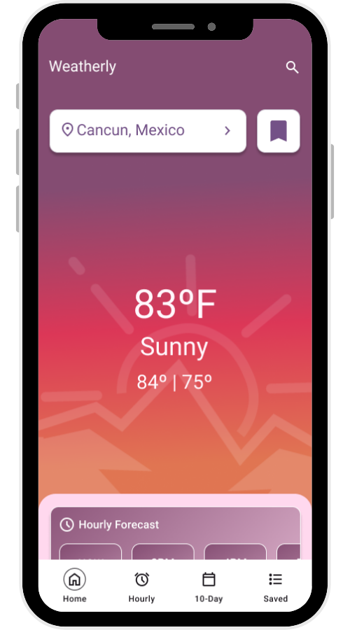


Home Page Dashboard


Home Page Widgets

Hourly Forecast widget scrolls horizontally to allow users to view weather predictions for the rest of the day.


Hourly Forecast & 10 Day Forecast Pages

Hourly Forecast for Android Devices

10 Day Forecast for Android Devices


Hourly Forecast for iOS Devices


10 Day Forecast for iOS Devices


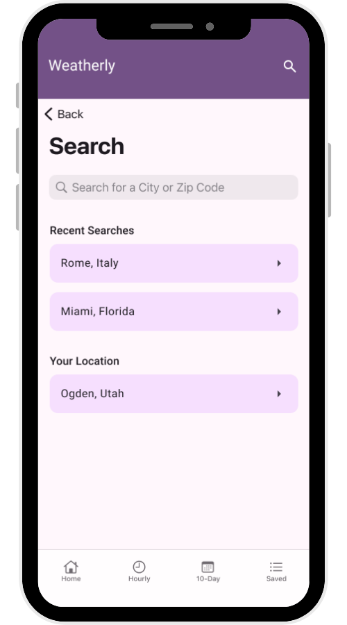
Search & Saved Locations Pages
Android Devices


iOS Devices


Saving a New Location
3. Usability Testing
Testing with the high-fidelity prototype revealed several usability issues that guided the next stage of refinement. Users expected the location title button to link directly to the search page rather than the saved locations page, indicating a need to adjust navigation flows. Feedback also showed that the search bar placement and function on both the saved locations and search pages created confusion, suggesting clearer differentiation was necessary. In addition, participants noted that readability could be improved by increasing the contrast between white text and dark backgrounds, emphasizing the importance of accessibility in the final design.
-
Users expected the location title button to link directly to the search page rather than the saved locations page, indicating a need to adjust navigation flows.
50% of participants tested mentioned that they found it confusing to click on the “Location Button” in the header and have it go to the Saved Locations Page.
-
Feedback also showed that the search bar placement and function on both the saved locations and search pages created confusion, suggesting clearer differentiation was necessary.
Users were unsure of the difference between the search bars. Thought that the search bar on Saved Locations page would only search the “Saved Locations”.
-
Two participants mentioned having difficulty reading the text on the homepage. An investigation into this issue revealed that the contrast did not meet WCAG standards since the background opacity was set to 80% making it too light to have white text.
Navigation
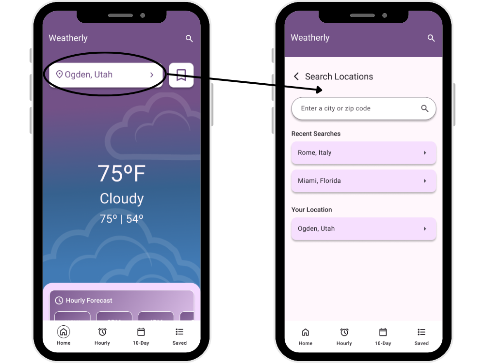
Initially when a user would click on the location button in the header, it would navigate to the saved locations page. After learning that this was not intuitive for users, the location button was changed to now link to the search page as shown.
Search Bar
Search bar on saved locations page now directs users to the search page where they are able to find new locations.

Readability
Originally, the contrast between the text and background did not meet WCAG standards because the background opacity was set to 80% making it too light to have white text. The background color was made darker to improve readability, contrast, and accessibility.
Contrast Before (4:1)

Contrast After (5:1)

4. Key Findings
Testing the updated prototype revealed significant improvements to the overall user experience. User ratings for ease of navigation rose from 3.38 to 4.25 out of 5 — a 26% improvement and ratings for task completion ease improved from 3.8 to 4.25, showing a 12% gain in usability perception. Additionally, tasks were completed in nearly half the time (54s → 28s), representing a 48% faster completion time. Average errors per task dropped from 6.8 to 2.2 — a 68% reduction in errors.
-
Participants responded positively to the navigation update, with the majority noting that clicking the location name to access the search page—rather than the saved locations page—felt more intuitive.
-
The streamlined search feature was especially well received, as all users agreed that the revised flow made the process clearer and less confusing.
-
Every participant confirmed that the updated darker purple background enhanced readability and visual comfort, validating the design change aimed at improving accessibility.
This project was developed as part of a group class assignment, with each team member contributing to different stages. While the final outcome reflects contributions from the entire team, the sections presented in this case study focus on my individual contributions and responsibilities, offering a reflection of my role within the team and the specific skills I applied to the project.
Disclaimer & Attribution
Team Members
Atley Egbert, Bryce Cottam, Madison Christensen, Sharon Dansie
Date Completed
Spring 2025
My Role
Design - Creating Low Fidelity Paper Prototype, Implementing Medium Fidelity Figma Prototypes, Designing iOS & Android High Fidelity Final Prototypes
Research - Secondary Research on AccuWeather & Analyzing Findings
User Testing - Recruiting Participants, Writing Interview Script, Conducting Interviews, & Analyzing Results
Usability Testing - Recruiting Participants, Writing Interview Scripts, Running Usability Tests on Three Prototypes, & Analyzing Results